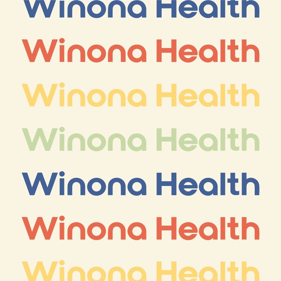
Winona Health
Project Scope
Branding / Print + Pattern Design / Illustrations / Social Templates
Winona, Minnesota was recently voted one of the cutest small towns in the Midwest, and we couldn't agree more! We had the pleasure of rebranding Winona Health, the premier healthcare system in Winona.
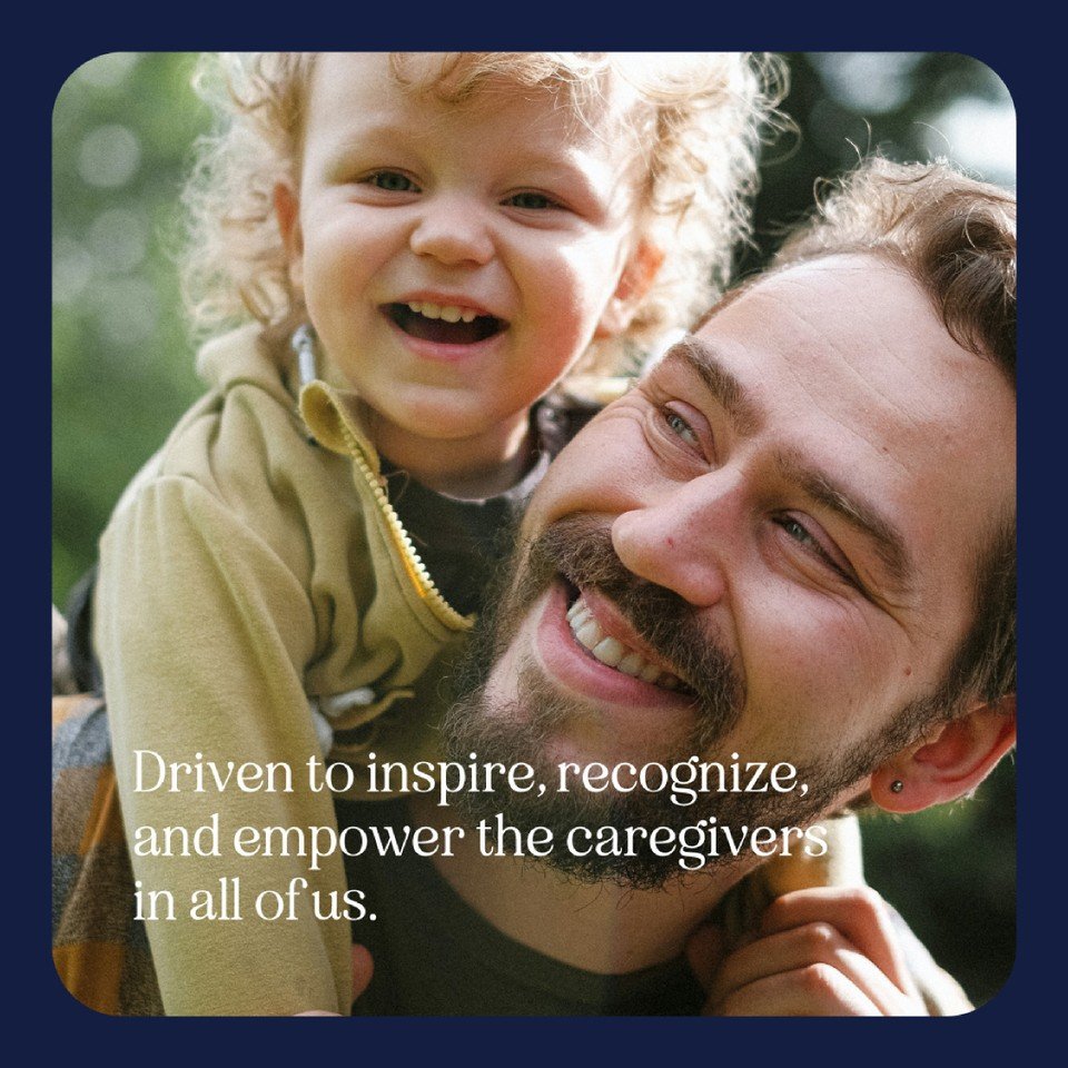
When deciding who to trust with your health, every detail matters. We aimed to create approachability through every point of communication, including on Winona Health's social media. Who says your healthcare system can't be your favorite IG follow?!
We visited and fell in love with the Winona Health staff and their welcoming, kind approach to everything they do. Winona Health is all about community, and our rebrand helped to emphasize its values and the stunning natural scenery the town is known for.
With custom patterns inspired by the river and bluffs of Winona, Minnesota, we added a playful element to this healthcare brand that can be used in anything from business cards to waiting room wallpaper.
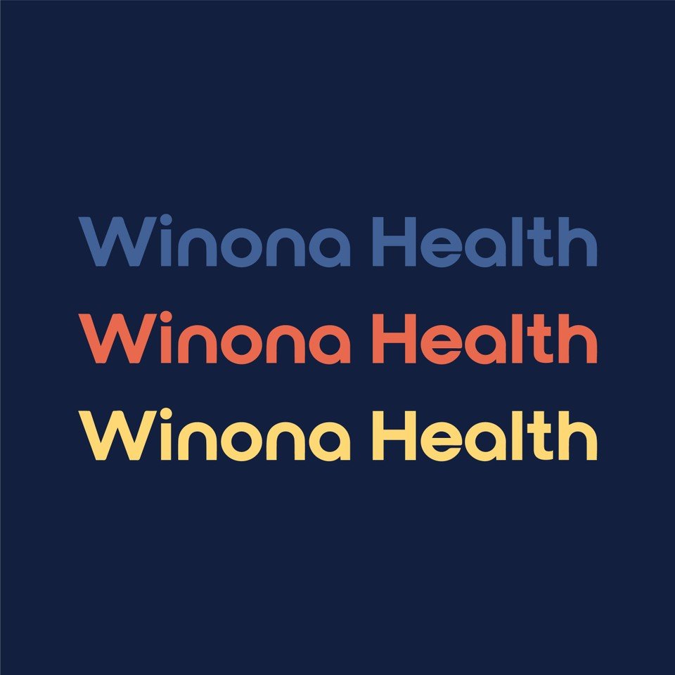
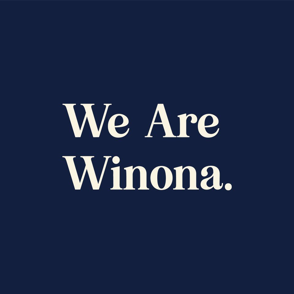
Winona Health came to us with a redefined manifesto of their Mission, Vision, and Values, and we were tasked with bringing their ideas to life visually - our favorite thing to do! With this simple tagline and updated logo, we were able to create a friendly, approachable mantra that calls back to their larger vision.
They are committed to creating the most inclusive, compassionate, and self-generating community health movement in the nation. Put simply, We are Winona!